

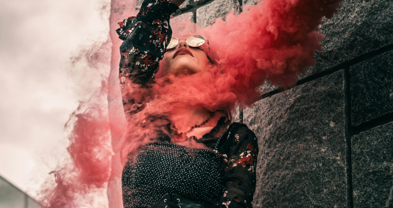
In photography, memorability rarely comes from subject matter alone. Two people can stand in the same field at sunset, wearing the same outfit, framed with the same lens, and yet one image will linger while the other disappears into the scroll. The difference is usually visual tension: something that catches the eye, shapes the mood, and gives the frame a stronger sense of identity.
That’s where coloured smoke can be surprisingly effective.
Used well, it does more than add spectacle. It introduces movement into a still image, creates separation between subject and background, and gives a photograph an atmosphere that feels deliberate rather than generic. In a time when audiences see thousands of images a day, that kind of distinction matters.
Why coloured smoke tends to stick in the mind
A memorable image usually gives the viewer more than one thing to look at. There’s the person, of course, but there’s also texture, shape, mood, and a sense that something is happening beyond the obvious.
It adds motion to a static frame
Smoke has form, but never a fixed form. It curls, breaks apart, catches light differently from one second to the next. That makes it useful in photography because it introduces movement without requiring the subject to do very much. Even a simple pose becomes more dynamic when the scene around it feels alive.
This is particularly valuable in portraiture, where the risk of stiffness is always there. A subject standing still can feel flat; a subject surrounded by drifting colour feels part of a moment.
It creates emotional shorthand
Colour has always done some heavy lifting in visual storytelling. Blue can feel cool or distant. Red brings urgency. Yellow can read as warmth, optimism, or tension depending on the setting. When that colour appears as smoke rather than a solid object, it becomes more atmospheric and less literal.
That ambiguity is useful. It allows the image to suggest emotion without spelling everything out. Instead of saying, “this is dramatic” or “this is playful,” the frame lets viewers feel it for themselves.
Where coloured smoke works best
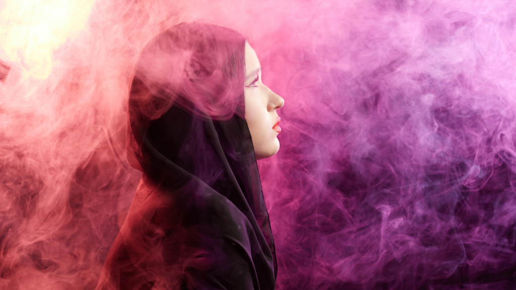
The strongest use of coloured smoke usually happens when it supports the concept rather than replacing it. In other words, it works best when the photo would still be interesting without it.
Fashion editorials often use smoke to exaggerate mood and give clothing campaigns a more cinematic edge. Engagement shoots sometimes use it to break away from standard romantic imagery and add a sense of occasion. Sports portraits can benefit too, especially when smoke echoes team colours or intensifies the gritty feel of the scene. Music photography, festival coverage, and brand campaigns all use it for the same reason: it helps create an image that feels designed, not accidental.
The key is choosing the effect with intention. Different colours, densities, and burn times produce very different results on camera, and photographers who want to experiment thoughtfully often start by understanding the range of smoke bomb effect products available before they build a concept around one. That matters because not every setting needs a huge plume, and not every composition benefits from the brightest colour in the box.
There’s also a practical side to this. Smoke can solve compositional problems. In a busy location, it helps simplify the frame by obscuring distractions. In a wide outdoor space, it can fill negative space and stop the image feeling empty. Against harsh or uninspiring backgrounds, it can create depth and separation that would otherwise need more elaborate lighting.
None of that means more smoke is always better. Quite the opposite. The most effective images usually use just enough to complement the subject. If the smoke becomes the only thing you notice, the photo starts to feel like a trick rather than a story.
Using smoke with intent
The difference between a striking image and a forgettable one often comes down to planning. Coloured smoke is visually powerful, but it’s also unpredictable. That unpredictability is part of the appeal, though it has to be managed.
Think in layers and contrast
Smoke photographs best when it has something to play against. Dark clothing against pale smoke. Bright smoke against a muted landscape. A side-lit plume against an overcast sky. Contrast gives definition; without it, the effect can look muddy or washed out.
It helps to ask a few simple questions before the shoot:
- What is the image actually about?
- Is the smoke supporting the subject, or competing with it?
- Will the colour harmonise with the wardrobe and location, or clash for the sake of it?
Those questions sound basic, but they prevent a lot of messy images.
Plan for light, wind, and timing
Smoke behaves differently depending on the conditions. In still air, it can gather and create dense pockets of colour. In wind, it may vanish before you’ve composed the frame. Backlighting can make it glow; flat midday light often makes it look less dimensional.
That’s why timing matters. Many photographers prefer the softer light of early morning or late afternoon, when colour reads well and the scene already has some atmosphere. Having an assistant helps too, especially when the subject needs to stay engaged while the smoke is released and the photographer adjusts position quickly.
And, of course, there’s the unglamorous but essential part: safety. Use smoke only where it’s permitted, follow venue rules, keep appropriate distance, and make sure everyone involved understands the plan. Memorable images are never worth careless execution.
Common mistakes that make smoke look forgettable
Oddly enough, the more dramatic the tool, the easier it is to misuse. The most common mistake is treating smoke as a substitute for concept. If the wardrobe, expression, location, and composition are all weak, coloured smoke won’t rescue the frame. It just makes the weakness more expensive.
Another common issue is poor colour choice. Highly saturated smoke paired with an already busy background can overwhelm the eye. The viewer ends up seeing noise rather than atmosphere. Similarly, using smoke in every frame of a shoot can flatten its impact. What feels exciting at first quickly becomes repetitive.
Then there’s over-direction. Some of the best smoke images come from responding to what the smoke does, not trying to force it into a rigid plan. Leave room for variation. A plume drifting off-centre or catching unexpected light may give you a stronger image than the one you storyboarded.
The real difference-maker: story
Ultimately, coloured smoke is memorable because it adds possibility. It gives still photography a fleeting, almost cinematic quality. But what makes the image last is not the smoke itself. It’s the feeling that the effect belongs there—that it reveals something about the subject, the mood, or the moment.
When photographers use it with restraint and purpose, coloured smoke does what all strong visual elements should do: it makes people pause. And in a crowded visual culture, that pause is everything.
Click here to discover more articles, tips, and resources designed to keep you informed.