The Evolution of Lorde’s Album Cover Art: A Visual Journey

The Lorde album cover has always been more than just artwork; it’s a window into her evolving artistry and a powerful statement. Her new album, Virgin, continues this tradition with headline-grabbing visuals that have sparked widespread discussion. If you’re looking for a quick overview of Lorde’s album covers, especially the impactful new ones, here’s a brief look:
- Pure Heroine (2013): A minimalist, stark black and white portrait reflecting her early, introspective sound.
- Melodrama (2017): A vibrant, painted portrait by Sam McKinniss, capturing the emotional intensity of heartbreak and self-findy.
- Solar Power (2021): A playful, sun-drenched image from below, symbolizing a shift towards nature and personal freedom.
- Virgin (2025) – Standard Edition: An X-ray of a pelvis with an IUD, signifying transparency, rebirth, and inner truth.
- Virgin (2025) – Vinyl Edition: A controversial close-up of Lorde’s bare crotch through transparent pants, designed to challenge perceptions and provoke conversation.
Lorde’s visual choices consistently amplify her music’s themes, from the raw introspection of her debut to the bold, unapologetic statements of her latest work. Her provocative approach to album art resonates deeply, particularly within the vibrant cultural landscape of New York City, New York, where artistic expression is celebrated and debated.
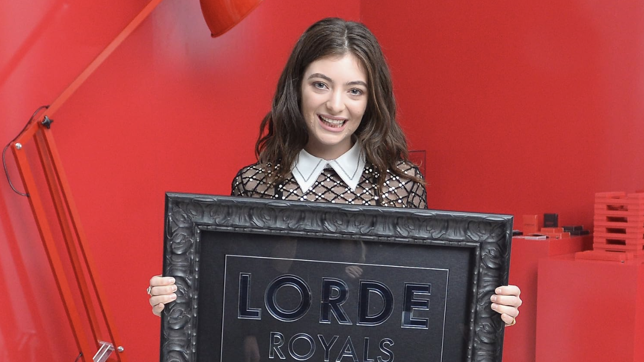
As R. Couri Hay, with over 40 years of experience, I’ve had a front-row seat to the trends and stories within high society, including the evolving narrative around the lorde album cover and its cultural impact in places like New York City. My column offers an exclusive pass to understanding these movements, bringing witty and insightful commentary to your attention.

Lorde album cover further reading:
5. Pure Heroine: The Minimalist Masterpiece

There’s something magical about a debut that changes everything. When Lorde released Pure Heroine in 2013, the lorde album cover was as as the music inside. At just 16, she gave us a black and white portrait that felt both intimate and mysterious – her face partially hidden, raw and unfiltered.
This wasn’t your typical pop star introduction. While other artists were drowning in glitter and neon, Lorde chose minimalism. The stark aesthetic perfectly captured what she was singing about: suburban ennui, the weird limbo of teenage life, and that sense of being teenage royalty in your own small world.
The creative team behind this iconic image knew exactly what they were doing. Charles Howells’ photography, combined with design work by Mario Hugo and Ania Nowak, created something that felt almost accidentally perfect. It was unpretentious yet profound – like finding poetry in a parking lot.
What made this lorde album cover so powerful was its stark contrast to everything else happening in 2013 pop music. No elaborate sets, no costume changes, no manufactured glamour. Just truth. This authenticity immediately caught the attention of New York’s indie music fans, who were hungry for something real in a sea of overproduced pop.
The cover became more than artwork – it was a statement. It whispered that this artist wouldn’t follow the rules, wouldn’t chase trends, and definitely wouldn’t apologize for finding beauty in the ordinary. Looking back, that simple black and white portrait was really a manifesto for a new kind of pop star, one who understood that sometimes the most powerful thing you can do is just be yourself.
4. Melodrama: A Pop Art Portrait of Heartbreak
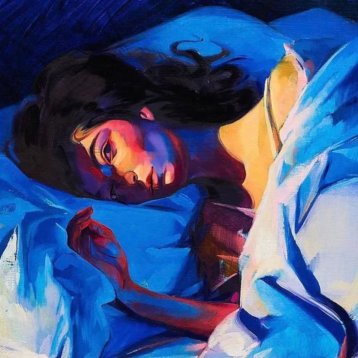
After the quiet, stark beauty of Pure Heroine, Lorde surprised us all with her 2017 album, Melodrama. The lorde album cover for this one was a complete visual shift, bursting with color and emotion! It was a true pop art masterpiece, painted by the wonderfully talented artist Sam McKinniss.
Imagine Lorde, captured in a private moment, lying in bed under a dreamy, almost magical blue light. McKinniss’s painting perfectly captures a sense of intimate vulnerability and that special “nocturnal energy” that often comes with deep thoughts. The vibrant color palette wasn’t just pretty; it perfectly mirrored the album’s raw exploration of heartbreak and finding yourself again. Lorde herself shared that Melodrama was all about “that Melodrama of your first big heartbreak.” And you can truly feel that intense emotion right there on the cover.
This striking lorde album cover quickly became a talking point, especially here in New York City, New York. McKinniss, with his strong ties to the city’s dynamic art scene, created something that felt both deeply personal and universally understood. The painting’s mix of real feeling and bold, almost theatrical, style resonated deeply within NYC art circles, where McKinniss’s unique vision is highly celebrated. It showcased Lorde’s amazing ability to use visuals to tell even more of her story, proving that even in sadness, there’s a vibrant, artistic beauty to be found. It was a true work of art that cemented her place as an artist brave enough to share her deepest feelings.
3. Solar Power: A Sun-Drenched Leap of Faith
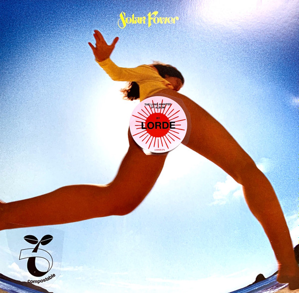
When Lorde dropped Solar Power in 2021, she delivered her most daring visual statement yet. The lorde album cover was a complete departure from everything we’d seen before – playful, bold, and absolutely sun-drenched in every sense of the word.
Ophelia Mikkelson Jones, Lorde’s friend and photographer, captured something truly special: a worm’s-eye view of the artist mid-leap on a beach, her silhouette dancing against a blazing sun. It’s the kind of shot that makes you squint just looking at it, all golden light and uninhibited joy.
Lorde herself called it “a little hardcore” and “feral,” but there’s something beautifully innocent about it too. This wasn’t just another album cover – it was a visual manifesto announcing a completely new chapter. Gone was the moody teenager from Pure Heroine and the heartbroken young woman from Melodrama. Here was someone embracing nature worship, freedom, and what she playfully dubbed her “weed album.”
The shift in persona couldn’t have been more dramatic. Where her previous covers invited us into intimate, indoor spaces, Solar Power literally pulled us outdoors, into the elements. It was Lorde’s way of saying she was done with the pressures of fame and social media, ready to bask in something more authentic.
What made this lorde album cover particularly fascinating was how it challenged expectations around female sexuality in art. As culture critic Jenessa Williams noted, it expressed sexuality without catering to the male gaze – a “risqué female-made expression of bodily autonomy” that tested how society reacts to women controlling their own narrative.
The image sparked conversation everywhere, but especially among New York’s creative community, where artists and critics debated its meaning and impact. Some regions, including mainland China and Saudi Arabia, censored it entirely – which only proved how powerful the statement really was.
It was Lorde at her most unguarded, making a visual declaration that she was ready to step into her own light, consequences be damned.
The “Virgin” Era: A Deep Dive into the New Lorde Album Cover Art
Get ready, because Lorde has done it again! With her latest album, Virgin, released on June 27, she’s not just given us new music, but a whole new visual experience. Lorde has always pushed the boundaries with her lorde album cover art, and this time, she’s gone even further.
The Virgin era brings us two distinct, yet deeply connected, visual statements. These aren’t just pretty pictures; they’re daring, thought-provoking pieces that invite us to look much deeper. They explore big themes like identity, being truly transparent, and what it means to be raw and unfiltered. It’s all about looking under the skin and seeing things anew, much like the vibrant art scene here in New York City, New York, where new ideas are always celebrated.
2. Virgin (Standard Edition): The Clinical and Mystical X-Ray

The main lorde album cover for Virgin is an X-ray image of a pelvis, featuring a belt buckle, pant button, pant zipper, and, notably, an intrauterine device (IUD). This striking and unconventional visual was captured by renowned photographer Heji Shin. Lorde described her artistic vision for the cover as wanting something “techy but like mystical,” and Shin’s raw photographic style, often seen in New York’s avant-garde art scene, perfectly delivers on this.
Lorde, who has synesthesia, also described the album’s color as “clear. Like bathwater, windows, ice, spit. Full transparency,” a concept powerfully conveyed by the X-ray’s ability to look beneath the skin. This imagery is not just clinical; it’s deeply symbolic. It speaks to themes of rebirth, inner truth, and a profound form of transparency. Heji Shin’s work often explores the human body in its rawest forms, including X-raying pelvises and capturing images of crowning newborns, making her an ideal collaborator for Lorde’s exploration of these themes. The cover implies a “bloody labor of creativity” and the generative potential of the body, even when showing its internal, structured elements.
The X-ray, with its visible IUD, hints at Lorde’s personal journey, including a “deep breakup” in late 2023 and her decision to stop birth control, which she revealed inspired her first single “What Was That.” This lorde album cover is a bold statement about vulnerability and the unseen aspects of self, inviting us to contemplate what lies beneath the surface, both literally and metaphorically.
1. Virgin (Vinyl Edition): The Album Cover That Sparked Conversation

If you thought the X-ray lorde album cover was bold, wait until you see what Lorde did for the vinyl edition. This is where things get really interesting – and controversial.
The vinyl insert features a photograph by Talia Chetrit that shows a close-up of Lorde’s bare crotch through transparent pants. Yes, you read that right. It’s so explicit that vinyl copies came with a parental advisory warning for adult imagery – something we’ve never seen with Lorde’s previous releases.
Chetrit, who’s deeply connected to New York’s art scene, is known for exploring themes of undress and power dynamics in her work. Her self-portraits often feature similar see-through garments, playing with the tension between what’s hidden and what’s revealed. This makes her the perfect collaborator for Lorde’s exploration of vulnerability and transparency.
The image works beautifully with the main X-ray cover, both literally and symbolically. While the X-ray shows us what’s beneath the skin, this photograph challenges our ideas about modesty and exposure. It’s raw, unfiltered, and completely unapologetic – everything the album title Virgin represents.
The internet’s reaction was immediate and intense. One mocking post on X (formerly Twitter) racked up 86,000 likes, and fans cleverly dubbed the image “the Lord(e)ussy.” The response was a fascinating mix of shock, delight, and genuine admiration for Lorde’s fearless artistic vision.
But here’s the thing – controversy often drives success. Despite (or maybe because of) the heated discussions, Virgin achieved 31,000 vinyl sales in its first week in the US alone. That’s Lorde’s biggest vinyl week ever, proving that bold artistic statements can translate into commercial success.
This lorde album cover represents more than just provocative imagery. It’s a powerful statement about female autonomy, artistic freedom, and the courage to be completely transparent – literally and figuratively. When female artists are often told to tone it down, Lorde cranked it up to eleven, and New York’s creative community took notice.
Fan Reactions and Cultural Impact in New York and Beyond
When Lorde unveiled the lorde album cover for Virgin, particularly the vinyl edition’s provocative close-up photograph, the response was immediate and intense. From the busy art galleries of Manhattan to social media feeds worldwide, people couldn’t stop talking about it.
The reactions were as diverse as they were passionate. Some fans expressed genuine shock at the explicit imagery, while others celebrated it as a bold feminist statement about body autonomy and artistic freedom. The lorde album cover sparked countless discussions about the female gaze versus the male gaze, with many praising Lorde for taking complete control of how her body was presented.
Online, the response was swift and sometimes humorous. One particularly cheeky Twitter post mocking the cover received over 86,000 likes, and fans creatively dubbed the image “the Lord(e)ussy” – a playful internet nickname that perfectly captured the mix of surprise, delight, and bewilderment many felt. Yet beneath the jokes lay serious conversations about art, identity, and the boundaries of self-expression.
New York City’s art community acceptd the controversy with characteristic enthusiasm. The city’s galleries and cultural spaces buzzed with discussions comparing the cover to other provocative works in art history. Many drew connections to the album’s deeper themes, particularly the lyrics “Some days I’m a woman, some days I’m man” from the track “Hammer,” seeing the lorde album cover as a visual exploration of fluid identity and transparency.
Lorde herself leaned into the unconventional approach with her promotional strategy. Her surprise appearance at Washington Square Park was meant to be an intimate album announcement, but thousands of fans showed up, forcing the NYPD to shut down the event due to overcrowding. These guerrilla-style pop-up events perfectly matched the raw, unfiltered energy of the album itself.
Despite – or perhaps because of – the controversy, Virgin achieved remarkable commercial success. The album soared to number one in both New Zealand and the UK, marking significant milestones for Lorde’s career. In the US, it debuted at number two on the Billboard 200 with 71,000 album-equivalent units, including an impressive 31,000 vinyl sales – her largest vinyl week ever.
Critics were equally impressed, awarding Virgin a Metacritic score of 82 out of 100 and describing it as a “gritty, tender, and often transcendent ode to freedom and change.” The lorde album cover had done exactly what great art should do: it started conversations, challenged perceptions, and left a lasting impact on everyone who encountered it.
The cultural ripple effects continue to resonate, particularly among New York audiences who have always appreciated artists willing to push boundaries and provoke meaningful dialogue about identity, expression, and the power of visual storytelling.
Frequently Asked Questions about the Lorde Album Cover for ‘Virgin’
The bold and provocative lorde album cover for Virgin has sparked countless conversations and questions since its release. As someone who’s witnessed decades of artistic statements in New York City’s vibrant cultural scene, I understand why these visuals have captured so much attention. Let me address the most common questions I’ve been hearing.
Who photographed Lorde’s ‘Virgin’ album covers?
Lorde chose two incredibly talented photographers to bring her vision to life, each bringing their own unique perspective to the album’s complex themes.
Heji Shin created the standard edition’s striking X-ray image. Shin is celebrated in New York’s avant-garde circles for her raw, uncompromising photographic style. Her work often explores the human body in its most honest forms, from X-rays to intimate portraits of birth and identity. When Lorde described wanting something “techy but mystical,” Shin’s ability to find beauty in clinical imagery made her the perfect collaborator.
Talia Chetrit photographed the controversial vinyl edition cover. Chetrit has strong ties to New York’s art scene and is known for her exploration of power dynamics and the psychology behind imagery. Her self-portraits frequently feature transparent garments, playing with themes of illusion and vulnerability. This background made her an ideal choice for Lorde’s most daring visual statement yet.
Both artists understood Lorde’s desire to create something deeply personal while challenging conventional expectations of what album art can be.
What is the meaning behind the album title ‘Virgin’?
The title “Virgin” goes far beyond any simple interpretation. Lorde has shared multiple layers of meaning that make this lorde album cover and album concept so compelling.
Rebirth sits at the heart of the album’s meaning. Lorde connects the title to starting fresh after significant life changes, including a major breakup in late 2023 and her decision to stop taking birth control. She describes it as being “untouched” by past experiences in a way that allows for profound personal growth.
The concept of a raw and unfiltered state of being also drives the album’s themes. Lorde compares this to “virgin metals” – pure and unalloyed. It’s about returning to your most essential self, stripped of external influences and societal expectations.
Awakening represents another crucial element. The album explores Lorde’s physical and emotional awakening, including new insights into her own body and identity. She believes that putting “the deepest parts of ourselves to music” is what “sets us free.”
The title also touches on fluid gender identity. Lorde has shared that “Virgin” relates to being “not attached to a man” and explores androgynous themes. This connects to lyrics like “Some days I’m a woman, some days I’m a man” and her public discussions about gender fluidity.
How did the ‘Virgin’ album perform commercially?
Despite – or perhaps because of – the controversial lorde album cover, Virgin achieved remarkable success both critically and commercially when it was released on June 27.
Critical reception was overwhelmingly positive. The album earned a Metacritic score of 82 out of 100 based on 20 critic reviews, achieving “universal acclaim” status. Critics praised its introspective nature and thematic depth, with many noting how Lorde had evolved as an artist.
The chart performance was equally impressive. In New Zealand, Virgin debuted at number one, marking Lorde’s fourth consecutive chart-topper in her home country. It also became her first album to reach number one on the UK Albums Chart. In the United States, the album debuted at number two on the Billboard 200 with 71,000 album equivalent-units in its first week.
What’s particularly fascinating is the vinyl sales success. The album achieved 31,000 vinyl sales in the US during its first week – Lorde’s largest vinyl week ever. This suggests that the controversial vinyl lorde album cover actually drove interest rather than deterring buyers.
The commercial success demonstrates how New York audiences and fans worldwide responded to Lorde’s willingness to push boundaries and create meaningful art, even when it challenges conventional expectations.
Conclusion: Lorde’s Unflinching Artistic Vision
Looking back at Lorde’s visual journey, we see an artist who has never shied away from making bold statements. Her lorde album cover evolution tells a story that’s as compelling as her music itself. From the raw, teenage vulnerability captured in Pure Heroine’s stark black and white portrait to the emotional intensity of Melodrama’s painted bedroom scene, each cover has been a window into her soul.
The sun-drenched leap of faith that was Solar Power showed us an artist embracing freedom and joy. But it’s the Virgin era that truly showcases Lorde’s unflinching artistic vision at its most powerful. The clinical yet mystical X-ray of the standard edition, combined with the provocative transparency of the vinyl insert, represents her boldest artistic statement yet.
These visuals don’t just accompany her music—they embody it. The themes of rebirth, transparency, and fluid identity aren’t just sung about; they’re literally exposed through Heji Shin’s raw X-ray aesthetic and Talia Chetrit’s challenging photography. It’s art that demands we look beneath the surface, that challenges our comfort zones, and that refuses to apologize for its authenticity.
What strikes me most about Lorde’s approach is how she balances profound vulnerability with complete artistic control. She’s not just showing us her body or her inner thoughts—she’s curating exactly how we see them. As she puts it, putting “the deepest parts of ourselves to music is what sets us free,” and her lorde album cover choices prove she practices what she preaches.
Here in New York City, where artistic expression thrives on pushing boundaries and sparking conversation, Lorde’s work resonates deeply. Her influence on our city’s vibrant cultural landscape is undeniable—from the packed Washington Square Park gathering to the ongoing discussions in our art circles about the meaning behind her bold visual choices.
At R. Couri Hay Columns, we’ve watched this evolution with fascination. Lorde represents exactly the kind of fearless artistic vision we love to celebrate—one that doesn’t just follow trends but creates them. Her journey reminds us that true artistry often requires courage, and the willingness to be misunderstood in service of a deeper truth.
Read more of our exclusive society and culture commentary for more insights into the artists and cultural moments shaping our world.
As we look toward what Lorde might create next, one thing is certain: whatever visual statement she makes will be entirely her own, uncompromising and unforgettable. That’s the mark of an artist who truly understands the power of image and isn’t afraid to wield it.